On The Cover Of A Magazine

You know the old saying "don't judge a book by it's cover". And, yes, that's true in so many ways. But I have a weakness for beautiful magazine covers. Many of them are like works of art, and are too pretty to store away with only their spine showing. I want to have them out on display.


Models.com posted a feature recently on their favourite covers for 2012, the ones with maximum visual impact. "The wealth of inventiveness has pushed magazine covers to new levels of creativity"...


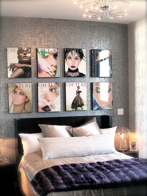
My favourites for 2012 were the four individual covers created for Vs Magazine. They featured an all star cast of Liv Tyler, Amanda Seyfried, Coco Rocha, and Rachel McAdams. I'd like to frame these and hang them in my daughter's bedroom. They remind me of David Bromley's nude series.


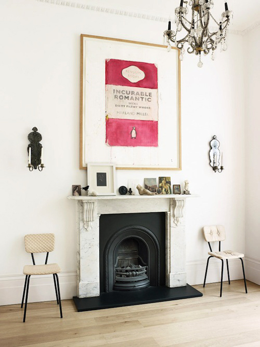
Framing and hanging magazine covers on the wall is a great way to have you favourites permanently on display...


via


These vintage Vogues are perfect for a dressing room...


via


Or, for a more casual look, you can do what I did as a kid, and wallpaper your entire wall...


via

Reading Material

I have updated the online magazine column (below right), and there a couple of gorgeous new issues out. Fete issue no. 4 is embracing the last of the cooler months (for those of us down under) and share some great ideas for passing the time. Be warned... it will make you very hungry!


My other favourite article is the one about the very funky graphic design studio in Adelaide, Parallax. I've worked in a few not-so-inspiring workplaces, so I absolutely love the environment they have created here, including the in-house caravan for private meetings and brainstorming.

I love how the girls have colour coordinated their outfits with the interior for the shoot

Inside the caravan - the perfect spot for a casual meeting, so cool!

The meeting room and subtly sign written street window


Also with a new issue out is Funkytime. If you love craft and DIY, you absolutely need to check this out. It's chocka full of fun projects for you to create. Even if, like me, you're not so crafty, but just love colour and pretty things, this is a must-see magazine.


Penguin Books

Penguin Books revolutionised publishing in the 1930s through it's high quality, inexpensive paperbacks. Avoiding the gaudiness of other paperback publishers of the time, Penguin opted for the simple appearance of three horizontal bands, the upper and lower of which were colour coded according to which series the title belonged to. In the central white panel, the author and title were printed in Gill Sans typeface.


Group them together in colour blocks


With their range of simple, bright coloured, uniformed covers, they have become popular to have on display. They look quite stunning when grouped together in colour blocks. I recently came across this photo (below) of a Penguin book blown up and framed, which I think is gorgeous. And after further searching I was pleasantly surprised as to how many Penguin products are available. Not bad for a design created by a twenty-one-year-old graphic designer nearly 80 years ago!


Simple and graphic, this print looks stunning in it's neutral surroundings

A collection of coffee mugs

A box of 100 postcards each featuring a different and iconic Penguin book jacket

I love these deckchairs available in a range of bright colours

Also available in drink bottles and luggage tags