
I love to use colour in my interiors, it's a brilliant way to make an impact, and it makes me happy. If you're a bit nervous about using bright colour, just work with it in small doses. In fact, it can be more powerful if you show a little restraint. I'll give you some examples...
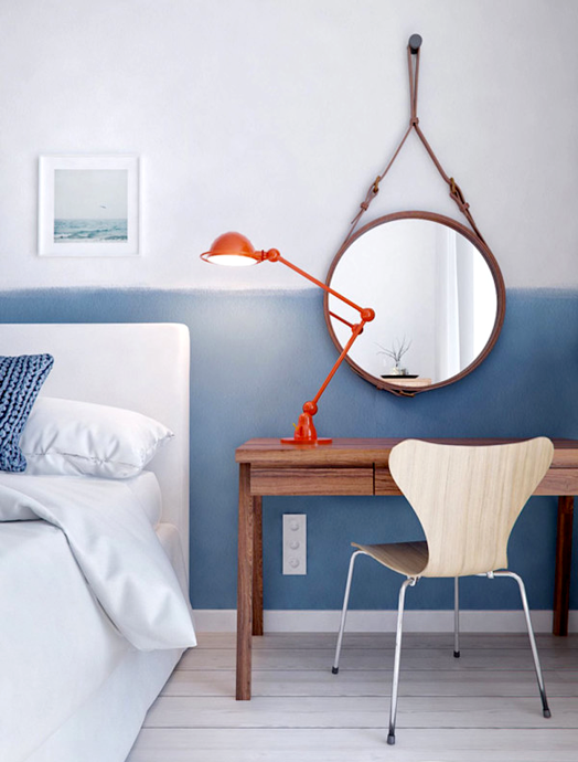
This room has a clean base palette of white and wood. A gorgeous injection of colour in the accessories adds vibrancy to the space, but it's all removable and replaceable - accessories are a great way to experiment with colour in your home. Notice that while very bright, the colour palette has stayed consistent - try and stick to three main tones.

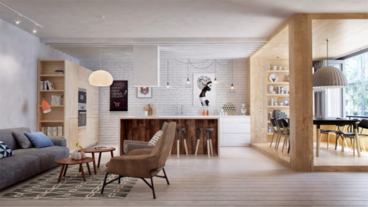
Once again this dining room has a neutral base as a starting point. Having one coloured light and one coloured chair is fun and playful without going overboard.

If you feel brave enough to add colour to a more permanent element in your home, take inspiration from this beautiful kitchen. The green laminate bench top is stunning, and with white it's a lovely fresh combination. Keeping everything else around quite simple makes the bench top really shine.

The yellow in this kid's bedroom is super bright and fun, but it's calmed down by all the black and white. The single shot of soft pink brings some relief by giving your eye something else to focus on.

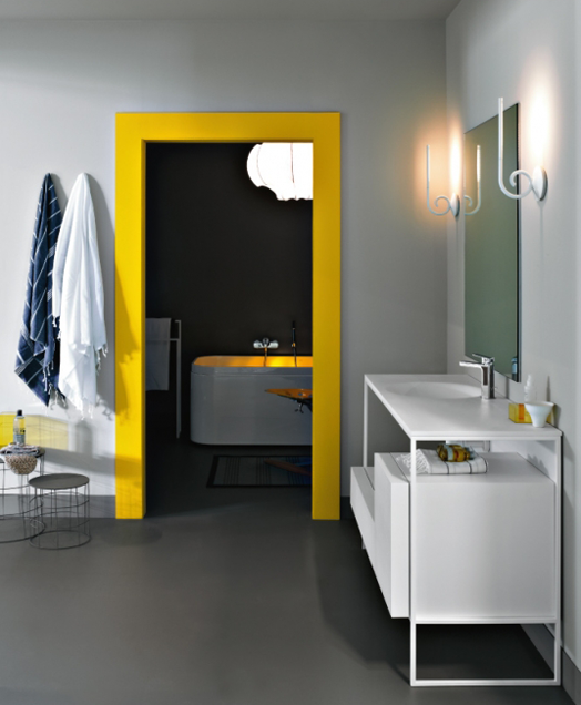
If a whole wall of colour is too much for you, how about a smaller feature?! A painted door frame makes a cool statement and also frames and highlights whatever is beyond.
I hope I've inspired you to bring some colour into your world, if only in a small way.
This room has a clean base palette of white and wood. A gorgeous injection of colour in the accessories adds vibrancy to the space, but it's all removable and replaceable - accessories are a great way to experiment with colour in your home. Notice that while very bright, the colour palette has stayed consistent - try and stick to three main tones.
Once again this dining room has a neutral base as a starting point. Having one coloured light and one coloured chair is fun and playful without going overboard.
If you feel brave enough to add colour to a more permanent element in your home, take inspiration from this beautiful kitchen. The green laminate bench top is stunning, and with white it's a lovely fresh combination. Keeping everything else around quite simple makes the bench top really shine.
The yellow in this kid's bedroom is super bright and fun, but it's calmed down by all the black and white. The single shot of soft pink brings some relief by giving your eye something else to focus on.
If a whole wall of colour is too much for you, how about a smaller feature?! A painted door frame makes a cool statement and also frames and highlights whatever is beyond.
 |
| 1 | 2 | 3 | 4 | 5 |
I hope I've inspired you to bring some colour into your world, if only in a small way.


