Pinterest is an important tool for me and my work, and it's a great source of inspiration. When I come across an image I love, I pin it to one of my boards, and I also often share it on my Facebook page. Today I have chosen a few random, beautiful images with the purpose of explaining to you why I like them, and why they work... I'm drawn to strong, graphic elements, and this large painted "N" is a fantastic alternative to a smaller wooden or metal letter representing your child's name. If you have a statement piece of furniture, artwork or element in your room, give it maximum impact by keeping the surrounding elements simple and pared-back. Your eye will be drawn to the "hero" piece and will not be fighting with things around it.
Likewise in this room, the colour palette is quiet and subtle, allowing the framed photography to shine. When it comes to artwork, bigger is better, in my eyes.
There are always exceptions to the rule, though. In this image the wall sconce and small framed print work beautifully together. The wall sconce does it's job to light the room, and the artwork helps to anchor the light so it doesn't just 'float' on the wall. As well as lighting the room the sconce also highlights the artwork.
This artwork is anchored by the furniture below. The three pieces enhance each other and work together to form a triangle that keeps your eye moving comfortably around. This is one of my most favourite little settings, I love everything about it from the arrangement, to the pattern and colour, and the pieces themselves. No surprise that I love it when it's from the home of my favourite artist, Miranda Skoczek.
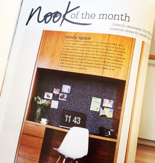
I love to find solutions for decorating small nooks, you can find one each month in Your Home & Garden's "Nook of the Month". This little dining nook is perfect for when you don't have a big space. Having a built-in bench seat means you can push the table up close to the wall, and it also serves as a lovely spot for relaxing. The large mirror is a trusty tool for creating the illusion of more space, and here it also reflects more light into the room providing a lovely airy feel.
It's no secret I love round tables. They're not right for every room, but they are great when your dining area is open plan and a thoroughfare through to other areas of your home. The nature of the circle means it's easier to move around it.
I'll be bringing you more of these "Why It Works" posts. If you have any interior questions feel free to email them to me, and I may be able to address them in one of these posts.
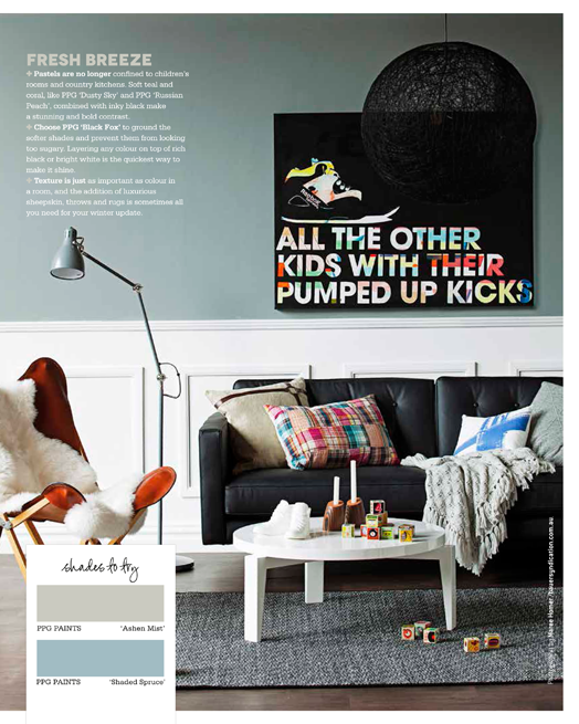
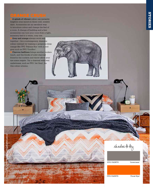
The latest Your Home and Garden magazine is on the news stands, and I'm thrilled to have another colour story featured in it. This time it focusses on the hottest colours for the cool winter months.
I also write the monthly "Nook of the Month", and this issue is a beauty. It was lovely to read in the front of the latest Your Home and Garden magazine how previous "Nooks" had inspired a couple of readers to create their own - that's awesome! If you haven't already, make sure you pick up your own copy, I'm sure you'll be inspired too.
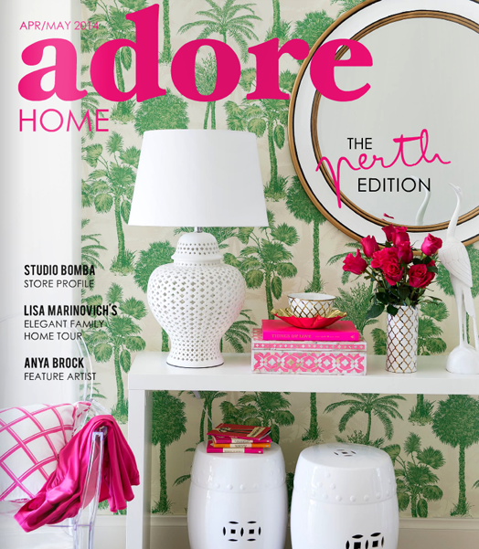
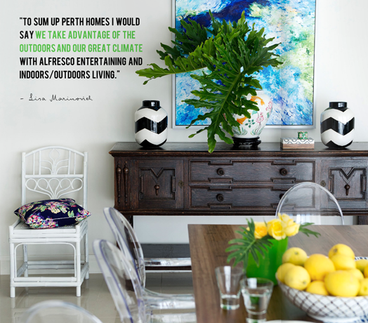
I'm finishing this working week off with a few magazine excerpts. First... the latest edition of Adore Home magazine is out, and is amazing, as always. It's focus this issue is on the beautiful city of Perth.
There's a lot of inspiration, and as usual, my favourite are the home tours. The first home belonging to interior designer, Lisa Marinovich, is a beautiful example of how you can use pattern and colour to bring a space to life. She's used one of my absolute fave wallpapers, Coconut Grove, which also appears on the cover.
The next home I love too, although it's very different to the first. It's funny... I feel like if you throw both homes in a big bowl and stir them around, you'll get my perfect home! I love the edginess of Samantha Tatulli's home. Samantha is also an interior designer, she works for Coco Republic, and she has a more neutral colour palette with the addition of warm leather, gold and greenery. If you look at both home owner's fashion style, it's a real reflection on their interior style. I often tell people to look to their wardrobe to help with their choice of colour palatte. There's so much more to see, so find some time this weekend to read all of Adore.
Dale & I, Bibby + Brady, were recently asked by Habitat, the Resene Magazine, to come up with an alternative room scheme. They sent us a photo of the original dining room and asked us to re-design it with our choice of furnishings and, of course, our Resene paint colours. We love the result...
And last but definitely not least, make sure you check out my new "Nook of the Month" in Your Home & Garden magazine. Each issue will have a new nook - ideas for what to do with an under-utilised, or awkward space in the home. You know I'm all about 'nooks', and there are some fantastic ones coming up, so pick you copy today.
Have a brilliant weekend everyone. See you next week, I've got some great things to share with you then.