Last year I did a blog post called "Light & Bright" with the intention of making it a regular feature. I don't know why I haven't done any since, as I love the idea behind it, but I will definitely make an effort to bring you more. I am a lover of colour, but I also appreciate a beautiful neutral space, so I have chosen different areas of the home, one example of which is 'light' and one which is 'bright' - you decide which speaks loudest to you. As with all of my favourite neutrals, this outdoor space works so well because of the beautiful mix of textures and layers of subtle tones. The sofa looks deliciously comfy, and I love the patina of the concrete.
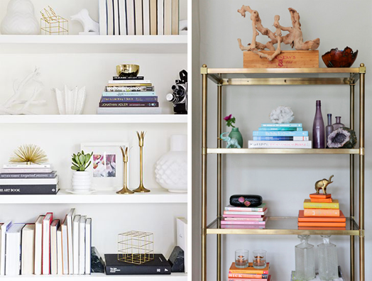
Aaah, how I love a well styled bookshelf! On the left the books' spines are all facing inwards leaving only the white pages visible. It's kept quiet and sophisticated with the brass ornaments, and only a tiny hint of colour. On the right the spines of the books are the feature and have been organised in their colour groups for maximum impact.
Once again, my bright room has a neutral base. It's the way I like to decorate - start neutral and then layer the colour and pattern on top. That way you can add a little or a lot, depending on your taste. The rug is the 'hero', and the blue is then picked up in the decor around, and balanced by the yellow and orange tones.
I think this dining room is sooo cute - oh so sensible and classic, but then there are those gorgeous pink legs! Mostly light, but a teeny bit bright - love it!
Because the table and chairs (and the cabinetry behind) are so vibrant and eye-catching in this dining room, it's nice to keep everything around them pared back. Except for the little bit of red in the lights upstairs - that provides a visual link between the two levels.
I came across the Holiday House Hamptons website in the weekend, and was inspired by it's concept. Founder, Iris Dankner, is passionate about interior design, and decided to combine it with her other passion of fundraising for breast cancer research. She created a fundraising event by inviting talented designers from across the US to transform the historic Academy Mansion on Manhattan's Upper East Side. Now an annual event, the 2014 Holiday House Hamptons is being held at Watchcase in Sag Harbor, showcasing stylish summer living and entertaining.
Each space is designed around a holiday or special moment in life that inspires the designer. These are some of my favourite rooms. Tamara Magel was inspired by European culture and the casual style of Sag Harbor. The clean and sophisticated palette reflects the beach and boating lifestyle of the area.
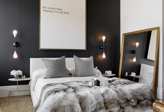
I love the mix of textures - the brick wall, the wooden floor and ceiling, and the sisal rug contrast the smooth marble and brass side table, and the black wall. Even the clever art piece above the bed features subtle texture. The throw and bedding add softness, and it's styled simply but beautifully to let each piece shine.
Campion Platt designed this master bedroom channeling the "straightforward sensual exuberance of a wealthy Hamptonite". They complemented the industrial nature of the room with soft feminine touches and a bold colour palette.
The floral theme carries on into the bathroom, which I adore. The same colours are used to link the two rooms, but in a much more subtle way.
This study/bedroom is the work of Bjørnen Design, and the theme, Seahorse Country, is a playful reference to the surrounding coastal sea life and equestrian culture of East End farms. The beautiful aquatic tones and patterns are quite stunning, and the rustic wooden coffee tables adds some weight and grounds the space.
The fun continues into the bathroom which is a jungle of plants bringing delicious texture, not to mention life!
This would be such a fun project for a designer - creating a space with no client, only unlimited imagination! I would LOVE it! To see more of the rooms pop over here, where Houzz contributor, and photographer, Rikki Snyder, gives us a rundown.
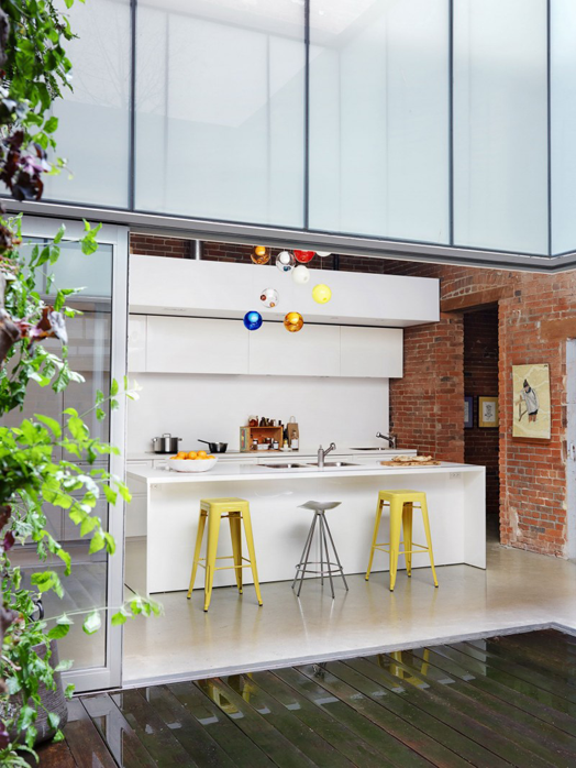
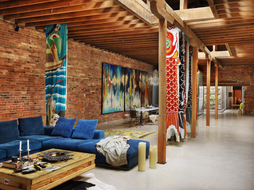
Let's start this week with some awesome interior inspiration. What I love most about this amazing Vancouver loft is the mix of materials and textures. Architect, Omer Arbel, took on this massive upgrade and restoration project, breathing new life into the heritage building.
A central courtyard allows light into the space. The existing shell remains bringing beautiful texture and a strong contrast to the smooth clean lines of the modern elements.
Rough concrete, polished concrete, wood, metal, and glass all work beautifully together, softened by textiles such as that gorgeous blue velvet sofa, throws and hanging fabric panels. This is definitely a brilliant example of how such contrasts can create such cohesion.