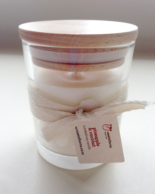
One of my favourite candle suppliers, Rose in Thorns, asked if I'd like to try their latest product, a soy glass candle. Because I'm of the opinion that you can never have too many beautiful scented candles, I was only too happy to oblige!
Made from natural soy wax, each candle is hand poured, topped with a wooden lid and tied with a soft, natural ribbon. You can rest easy knowing that soy wax is a natural chemical-free, biodegradable and renewable resource. And, when you've finished your candle, you can return the glass to Rose in Thorns to refill. Return four empty soy glass tumblers and receive one free.
The candle comes in two different sizes and a range of delectable fragrances - rose, frangipani, vanilla, mandarin & mimosa, jasmine & honeysuckle, pineapple & coconut, white tea, carnation, passion, sweet lemongrass, and red raspberry. I chose pineapple & coconut, and it is, quite simply, summer in a glass! I had it burning over the weekend and it filled the house with the most delicious summery scent.
One very important tip I'd like to share... the first time you burn a candle sets the stage for the life of that candle. If you burn the candle for a short time and only have a small wax pool, the dry hard wax around the outside will almost never burn - you'll get what is called "candle tunnelling". You want the wax to melt all the way to the edge, which usually means burning your candle for at least 3 hours. I highly recommend trying these gorgeous soy glass candles, and (as we get closer and closer to the festive season) they'd make great gifts for family, friends, or your kids' teachers.
Last year I did a blog post called "Light & Bright" with the intention of making it a regular feature. I don't know why I haven't done any since, as I love the idea behind it, but I will definitely make an effort to bring you more. I am a lover of colour, but I also appreciate a beautiful neutral space, so I have chosen different areas of the home, one example of which is 'light' and one which is 'bright' - you decide which speaks loudest to you. As with all of my favourite neutrals, this outdoor space works so well because of the beautiful mix of textures and layers of subtle tones. The sofa looks deliciously comfy, and I love the patina of the concrete.
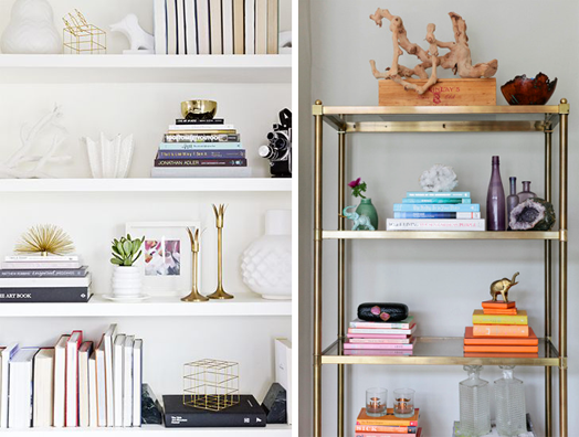
Aaah, how I love a well styled bookshelf! On the left the books' spines are all facing inwards leaving only the white pages visible. It's kept quiet and sophisticated with the brass ornaments, and only a tiny hint of colour. On the right the spines of the books are the feature and have been organised in their colour groups for maximum impact.
Once again, my bright room has a neutral base. It's the way I like to decorate - start neutral and then layer the colour and pattern on top. That way you can add a little or a lot, depending on your taste. The rug is the 'hero', and the blue is then picked up in the decor around, and balanced by the yellow and orange tones.
I think this dining room is sooo cute - oh so sensible and classic, but then there are those gorgeous pink legs! Mostly light, but a teeny bit bright - love it!
Because the table and chairs (and the cabinetry behind) are so vibrant and eye-catching in this dining room, it's nice to keep everything around them pared back. Except for the little bit of red in the lights upstairs - that provides a visual link between the two levels.
Pinterest is an important tool for me and my work, and it's a great source of inspiration. When I come across an image I love, I pin it to one of my boards, and I also often share it on my Facebook page. Today I have chosen a few random, beautiful images with the purpose of explaining to you why I like them, and why they work... I'm drawn to strong, graphic elements, and this large painted "N" is a fantastic alternative to a smaller wooden or metal letter representing your child's name. If you have a statement piece of furniture, artwork or element in your room, give it maximum impact by keeping the surrounding elements simple and pared-back. Your eye will be drawn to the "hero" piece and will not be fighting with things around it.
Likewise in this room, the colour palette is quiet and subtle, allowing the framed photography to shine. When it comes to artwork, bigger is better, in my eyes.
There are always exceptions to the rule, though. In this image the wall sconce and small framed print work beautifully together. The wall sconce does it's job to light the room, and the artwork helps to anchor the light so it doesn't just 'float' on the wall. As well as lighting the room the sconce also highlights the artwork.
This artwork is anchored by the furniture below. The three pieces enhance each other and work together to form a triangle that keeps your eye moving comfortably around. This is one of my most favourite little settings, I love everything about it from the arrangement, to the pattern and colour, and the pieces themselves. No surprise that I love it when it's from the home of my favourite artist, Miranda Skoczek.
I love to find solutions for decorating small nooks, you can find one each month in Your Home & Garden's "Nook of the Month". This little dining nook is perfect for when you don't have a big space. Having a built-in bench seat means you can push the table up close to the wall, and it also serves as a lovely spot for relaxing. The large mirror is a trusty tool for creating the illusion of more space, and here it also reflects more light into the room providing a lovely airy feel.
It's no secret I love round tables. They're not right for every room, but they are great when your dining area is open plan and a thoroughfare through to other areas of your home. The nature of the circle means it's easier to move around it.
I'll be bringing you more of these "Why It Works" posts. If you have any interior questions feel free to email them to me, and I may be able to address them in one of these posts.