Sunday on The Block Villa Wars was time to unveil the finished master bedrooms and ensuites, although only two out of the four teams managed to finish. A pay dispute between Cat and Mitch and their tiler put their ensuite behind, and they had to present their bathroom without grout or silicone. Money troubles and Hayden's health made for another difficult week for Jamie and Hayden, and in stark contrast Brooke and Mitch made Block NZ history to win three rooms in a row.
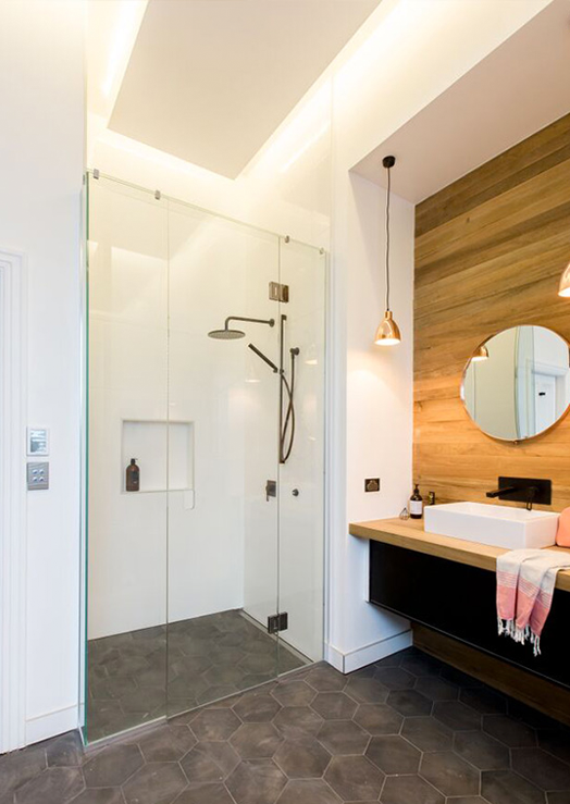
Brooke and Mitch: 1st place | 17.5 points
Sticking with their wining formula, Brooke and Mitch continued with Dulux Manorburn on the walls. What they do so well is produce a high quality finish, and that will impress potential buyers.

The brief was "loud and audacious" - this (in my opinion) is an odd theme for a bedroom which is often used as a peaceful retreat. Brooke and Mitch pushed the boundaries on their normal monotone colour palette to include splashes of mustard, and it was enough to impress the judges. I did like their long, built-in bedsides, but it does limit future owners to the size of their bed.

The size, practicalities, and finishes in the bathroom were fantastic, and once again, Mitch's plumbing skills were most handy, but I just don't love it. It's clean and practical, but unfortunately neither of these rooms excite me.


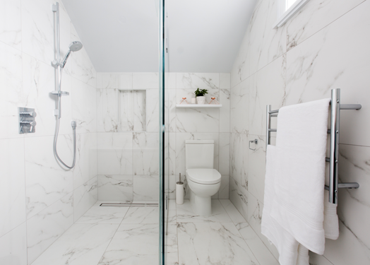
Sarah and Minanne: 2nd place | 16.5 points
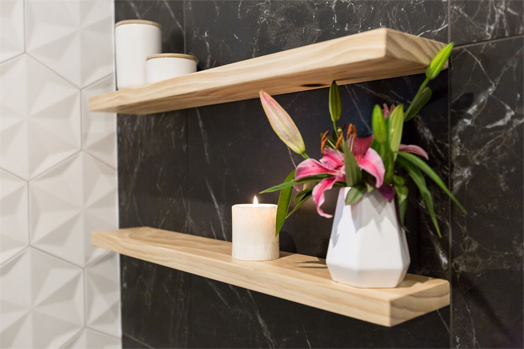
I would've loved Sarah and Minanne to win this week (we know they could use a win!). Their bathroom was my favourite, and while their master bedroom wasn't perfect, it's miles better than some of their previous rooms. I also love their colour palette with a base of Dulux Spirits Bay Double layered with white, warm wood and blush pink.

It's not loud and audacious, which may have lost them points, but can I say again that calm and restful is so much nicer for a master bedroom.

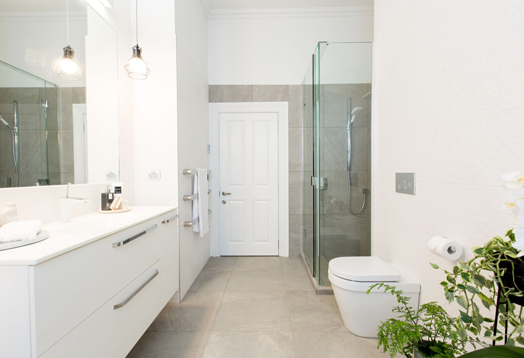
The girls bathroom is beautiful, but I am a big fan of marble and I know some are not. It ties in beautifully with their black marble bathroom in week 3. Everything is kept quite simple allowing the marble to be the hero, I like their choices, their layout and placement, and their refined styling.

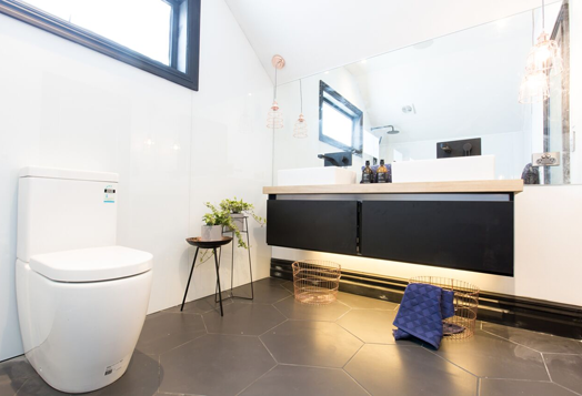
Cat and Jeremy: 3rd place | 15 points
With an unfinished ensuite Cat and Jeremy knew they couldn't win this week, but I still prefer their rooms to Brooke and Mitch's. Their master bedroom was reminiscent of their first bedroom in week 1 that gave them a win.

After being slammed for their choice of wall colour last week, the couple were smart enough to take their queue from interior designer and judge, Jason Bonham's website. They selected a soft grey Dulux Aniwaniwa, which I love.

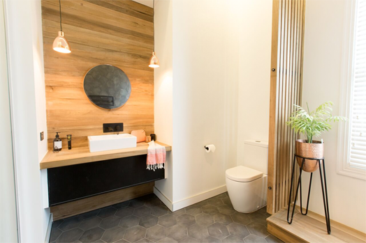
There are some nice things happening in Cat and Jeremy's bathroom too. The round mirror and basins help to soften the square lines of the vanity. I love the matt black accessories and the little plant corner down by the toilet.


Jamie and Hayden: 4th place | 6.5 points
Such a hard week for these guys. It was nice to see them win the challenge to turn junk into a house gift for one of their neighbours, but not much else went their way. Hayden was sick, which left Jamie to do a lot of the work (I think she is amazing, don't you?). She has supported Hayden's bold decisions to put black carpet throughout their home and on most of the walls, but, although very loud and audacious, it's not favoured by the judges.
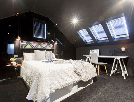
I do worry it will polarise them come auction day - people are either going to love it or hate it, which may reduce the amount of people wanting to buy the house. Dark rooms can be cosy and intimate, but it needed more sumptuous texture and a feeling of elegance. Instead the furniture and accessories made it feel a bit cheap - I know it's hard for them when they don't have the money to spend, they really need a win!

Unfortunately the bathroom was a bit lack lustre for me as well. It was OK, but bathrooms and kitchens are what sell houses, so they really needed some wow factor.

The first couple of episodes this week have produced some drama with dirty tactics sneaking in. I'm interested to see how this plays out and to see if anyone can knock Brooke and Mitch off the winning podium. Pop over to TV3 to check out more.
Brooke and Mitch: 1st place | 17.5 points
Sticking with their wining formula, Brooke and Mitch continued with Dulux Manorburn on the walls. What they do so well is produce a high quality finish, and that will impress potential buyers.
The brief was "loud and audacious" - this (in my opinion) is an odd theme for a bedroom which is often used as a peaceful retreat. Brooke and Mitch pushed the boundaries on their normal monotone colour palette to include splashes of mustard, and it was enough to impress the judges. I did like their long, built-in bedsides, but it does limit future owners to the size of their bed.
The size, practicalities, and finishes in the bathroom were fantastic, and once again, Mitch's plumbing skills were most handy, but I just don't love it. It's clean and practical, but unfortunately neither of these rooms excite me.
Sarah and Minanne: 2nd place | 16.5 points
I would've loved Sarah and Minanne to win this week (we know they could use a win!). Their bathroom was my favourite, and while their master bedroom wasn't perfect, it's miles better than some of their previous rooms. I also love their colour palette with a base of Dulux Spirits Bay Double layered with white, warm wood and blush pink.
It's not loud and audacious, which may have lost them points, but can I say again that calm and restful is so much nicer for a master bedroom.
The girls bathroom is beautiful, but I am a big fan of marble and I know some are not. It ties in beautifully with their black marble bathroom in week 3. Everything is kept quite simple allowing the marble to be the hero, I like their choices, their layout and placement, and their refined styling.
Cat and Jeremy: 3rd place | 15 points
With an unfinished ensuite Cat and Jeremy knew they couldn't win this week, but I still prefer their rooms to Brooke and Mitch's. Their master bedroom was reminiscent of their first bedroom in week 1 that gave them a win.
After being slammed for their choice of wall colour last week, the couple were smart enough to take their queue from interior designer and judge, Jason Bonham's website. They selected a soft grey Dulux Aniwaniwa, which I love.
There are some nice things happening in Cat and Jeremy's bathroom too. The round mirror and basins help to soften the square lines of the vanity. I love the matt black accessories and the little plant corner down by the toilet.
Jamie and Hayden: 4th place | 6.5 points
Such a hard week for these guys. It was nice to see them win the challenge to turn junk into a house gift for one of their neighbours, but not much else went their way. Hayden was sick, which left Jamie to do a lot of the work (I think she is amazing, don't you?). She has supported Hayden's bold decisions to put black carpet throughout their home and on most of the walls, but, although very loud and audacious, it's not favoured by the judges.
I do worry it will polarise them come auction day - people are either going to love it or hate it, which may reduce the amount of people wanting to buy the house. Dark rooms can be cosy and intimate, but it needed more sumptuous texture and a feeling of elegance. Instead the furniture and accessories made it feel a bit cheap - I know it's hard for them when they don't have the money to spend, they really need a win!
Unfortunately the bathroom was a bit lack lustre for me as well. It was OK, but bathrooms and kitchens are what sell houses, so they really needed some wow factor.
The first couple of episodes this week have produced some drama with dirty tactics sneaking in. I'm interested to see how this plays out and to see if anyone can knock Brooke and Mitch off the winning podium. Pop over to TV3 to check out more.