Chambourcin Cottage | Boutique Accommodation

2016 has been a brilliant year for Bibby + Brady, and one of the highlights for us has been working with our awesome clients, Kim Brann and Bruce Polderman, on their Te Awanga cottage. Designed and built in 1978 by Hawke's Bay architect, Steve McGavock, it's vaulted ceilings and use of native timber were inspired by renowned New Zealand architect, John Scott.

When we first visited the cottage in April this year we were excited about the potential. The bones were there, and the architectural details were fantastic, but everything was a little tired and it was in definite need of attention. Kim and Bruce had been living in the main house (which is a larger version of the cottage) for several months, and needed our help with paint colour and flooring, as well as what to do with the beams and lighting. The decision was made to start with the cottage. Initially, once renovated, the plan was to rent it out long term, but within the first few weeks it was decided to turn it into boutique accommodation - the perfect couple's retreat, "Chambourcin Cottage".

The first decision we had to make was what to do with the beams. It was quite dark in the cottage on our first visit (mainly due to some of the windows being covered) and the beams felt a bit heavy overhead, so our first instinct was to paint them white and make them disappear. But upon reflection we realised every detail of the architecture was well thought out and the beams were an important part of the design. All of the light and electrical switches were black, as were the negative skirting boards and architraves.

The beams were a dark brown that didn't look like a natural wood colour, so we wanted them to be painted black and the ceiling in Resene Quarter Merino for a crisp contrast. We chose Resene Eighth Lemongrass for the walls of the living room. The soft, peaceful colour with a hint of green complimented the black and white, and because the neutral tone had a touch of colour it helped move and bounce light around the room.

Kim and Bruce hired their own painters and builders who did a fantastic job. Painting the beams was a fiddly job, but the finish is excellent. The old joinery was replaced with new matt black joinery, and the woodwork was brought back to life. We wanted to keep the window treatments simple and unfussy, using white curtains and blinds with matt black accessories (curtains rods and cleats).

When it came to choosing furniture and accessories for the cottage we wanted to create a beautiful retreat with comfort in mind. The scale was important in the small cottage, so although the sofa is large and solid (and super comfy), choosing it in a colour similar to the wall means it takes up less visual space. Accents of velvet and brass introduce a touch of elegance. At the time of these photos the cottage was about 90% finished - this dining table is a stand-in as the brass and marble table we chose won't be ready until early next year; and a few finishing touches like art are still to arrive.

The flooring was old and varied throughout the cottage so we chose to use carpet in the bedroom only. Everywhere else features polished concrete which is both beautiful and practical. David Trubridge pendants in the living room and bedroom suit the style of the house and look amazing. We hung my own Billie Culy print for the photoshoot and we loved it in the space, although it was a little small, so we ordered a much larger one to take it's place.

The bedroom is a really great space. A queen size bed fits snuggly on one side with room for a chair in one corner, and another small wing fits a large wardrobe, a small desk and a loft above.

We painted the bedroom area the same Resene Eighth Lemongrass as the living room, and the beams and ceiling also got the same treatment. We commissioned Francois Guittenit of Le Workshop to make the floating bedside cabinets for us. As the space around the bed was tight, we didn't want heavy bedside tables taking up precious floorspace. They have an airy feeling and work perfectly. Bedside lamps are still to come and our upholsterer, Asha Payton of Little & Fox, is making us an upholstered bedhead.

In the corner adjacent to the bed the beautiful velvet arm chair echoes one we put in the living room. It sits below an artwork by Jane Denton which we love. The simplicity of this piece works really well with the mid century style of the cottage. Beyond is a little courtyard to sit and enjoy a coffee and the spectacular view in the morning, or a glass of wine in the evening.

I love the wardrobe and desk area of the bedroom. Kim and Bruce's builder Lee Tiedemann of Russell Knox Builders did an amazing job putting new doors on the wardrobe and installing the brass inset handles we chose. He also built the shelves to the left of the wardrobe.

I designed a screen for the side of the loft inspired by mid century breeze blocks, and Lee finished it off beautifully with a timber edge. Francois built the loft ladder and the little desk. Beautiful new wool carpet by Cavalier Bremworth was laid in the entire bedroom area.

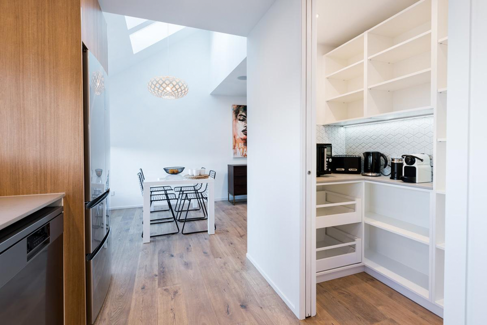
The original kitchen cabinetry was still in pretty good shape so it was given a new lick of paint and Lee added a wooden chopping board at the far left of the bench and a wooden surround to disguise the range hood.

Kim and Bruce wanted additional storage in the kitchen and a small table and chairs. Because of the tiny space Francois came up with the idea of building a unit that wrapped around one side of the kitchen. This not only gave them cupboards and shelves for storage, but also additional bench space and a breakfast bar overlooking the vineyard. It's the perfect use of the small space.

A small shelf was added above the stainless steel bench and we replaced all of the fluorescent lights throughout the cottage with copper tubular lights. We sourced a beautiful stoneware dinner set and accessories, and gorgeous hand blown glassware. All these details add to the experience for the lucky couples who choose to stay at Chambourcin Cottage.

On the other side of the kitchen is the front entrance and a hallway that runs down past the toilet and bathroom to the back door. When we started this project there were three different kinds of flooring from the back door through to the living room. Now it looks really smart with polished concrete flooring the entire length, softened by the occasional rug.

We designed a floating vanity similar in style to our bedside cabinets and Francois built and installed it in the hallway by the back entrance. Once again we wanted it to be floating to create a sense of airiness and space, and the large mirror above it reflects light around.

Opposite the vanity is the tiny bathroom. Although it caused a few heads to be scratched with things that cropped up along the way, we're really proud of this space as it's so awesome! We chose a small hexagon tile and the entire room is tiled from floor to ceiling. Matt black accessories pay homage to the original design details, and to add warmth we introduced accents of wood, brass and leather.

The outside of the cottage has come along way since we took this first photo (below) in April. We carried on the black and white colour scheme from inside, and worked with our favourite garden designer, Yo Kjestrup of Yo Designs, on the garden at the front. We wanted to create a garden with clean lines in keeping with the mid century style, and Kim and Bruce also wanted to direct people down past the French doors to the main entrance just beyond. Yo came up with a clever design using dark stained planter boxes to stop people from automatically entering through the French doors while also creating another private patio space.

We are so delighted with this little cottage, and Dael and I both love it so much we were ready to move in ourselves, as was our photographer Florence when she visited to take the photos. If you're looking for somewhere to get away for a relaxing and romantic break, I can't speak highly enough of Chambourcin Cottage in Te Awanga, Hawke's Bay. The views are spectacular over the boutique vineyard, Heretaunga Plains, and the Kaweka and Huiarau Ranges beyond, it really is a special place! Your hosts, Kim and Bruce, are the loveliest people and will be able to advise you on all the amazing things there are to offer around their beautiful coastal region. Tell them we sent you ;)

Click here to read more about this project and to see 'before' images.

Dream Home

I loved this first image (below) the moment I spied it on Pinterest. The blue walls and door are gorgeous, and I love how it frames the view through to the rooms beyond. So you can imagine my excitement when I found the entire home on Elle Decoration and every room was equally as gorgeous!

It belongs to Swedish blogger and photographer, Kristin Lagerqvist. Like me, Kristin has always loved blue, finding it a soothing, comforting colour. Blue is the common thread throughout the home where it features on walls, in wallpaper, furniture and accessories. It's balanced by fresh white, warm, rich wood tones and mossy greens.

Kristin used North Sea Paints, and they helped her develop the special shade of sky blue naming it after her - Krickelin Haze Blue ("Krickelin" is the name of her blog).

I love the wallpaper in the office (FYI... we can get this wallpaper for you, in case you love it as much as I do - email me for the details). The vintage desk and dresser, along with the chandelier Kristin inherited from her grandmother, add warmth and give the room a sense of depth and history.

The large kitchen is spacious and functional with beautiful brass handles and a marble bench top. I was happy to see the gorgeous blue and white bowl on the bench, as I have exactly the same one in my kitchen - great minds!

Also sharing my love of pattern, Kristin has used all sorts of amazing wallpaper throughout her home. The Designers Guild paper in the entranceway is another wallpaper you can source through us here at Bibby + Brady.

Stepping away from the blue tones momentarily, the bedroom is wallpapered in a restful tone of soft sage green. It echoes the greenery found both outside and inside the window.

I'm finishing this post with another room that makes me really happy. It features a stunning William Morris wallpaper in a metallic bronze. Originally produced in the 1880's it looks incredible in this 21st century home.

Photos: Andrea Papini  | Retouching: Jenny Soderstrom

There isn't one thing that I don't love in Kristin's home. The combination of colours, patterns, furniture and art choices are all amazing. This might just be my dream home!

The Block Kitchen + Dining | Girls vs Boys

I was impressed with all of The Block kitchens revealed on Sunday. It still amazes me that they can turn this room around in such a tight deadline, and the teams also had their dining room to complete. Kitchens are such an important part of the home and, like bathrooms, they require almost every trade, and huge amounts of planning and preparation. I was surprised with the judges scores though, what did you think?

Sam and Emmett: 1st place - 16.5 points (8.5 from Fiona and 8 from Paul)

Sam and Emmett took out the win this week, but their room definitely wasn't my favourite. I found their kitchen a bit too hard and shiny, and I wanted something to soften it. The strong contrast provided by the black and white is striking, but the open shelves and blank walls are crying out for something to break it up a bit. Maybe some natural wooden chopping boards, some potted herbs, some art, a touch of colour somewhere...

The microwave on the end of the bench became a feature, which I didn't like. Preferably tuck this away in a cupboard or somewhere discreet. What I do love is the little breakfast nook with the bar stools (although the stools will need to be replaced with lower ones), and the curved dining table, which does add some relief to the hard kitchen.

The shadows created on the ceiling from the David Trubridge pendant are beautiful, I would've hung it slightly lower though. When you hang a pendant over a dining table you don't have to worry about banging into it, but you obviously don't want it to obstruct your view of the person sitting opposite you - 80 to 100cm above the table top is good, but just use your eye to determine the best height in comparison to what is around and behind the table. The rug is great!

Dyls and Dylz: 2nd equal place - 15 points (8 from Fiona and 8 from Paul and a -1 from S+E)

After Fiona's scores were revealed, both boys teams were neck and neck at the front with 8 points. This prompted Sam and Emmett to play their "-1" point won in an earlier challenge. Although Dyls and Dylz wouldn't have quite won, the -1 meant that Niki and Tiff were able to draw with the boys for second place. I like the galley style layout of D+D's kitchen, and the light wood adds lovely warmth and texture.

The splash back is a photo of their feature schist wall in the bathroom. It's a clever use of continuity and if you love the schist wall, then you'll obviously love the splash back. I love the strip lighting on the kick boards.

I'm also a fan of their dining room. The large table and bench seats have a nice relaxed vibe, the rug is great, love the curtains and the grey feature wall, and I think they did a pretty good job at styling their table too - well done boys. Being picky, perhaps a slight tonal change between the table cloth and cushions, An inky blue table cloth would look lovely with the wood and the grey.

Niki and Tiff: 2nd equal place - 15 points (8 from Fiona and 7 from Paul)

I'll always be a fan of Niki and Tiff's style, and there is a lot I love in their kitchen and dining room, but I feel like they made a couple of mistakes this week. I'll start with the negative and move on to the positive. There seemed to be a mistake in measuring as I don't think the girls had intended for their bench and cabinetry to finish a bit short of the wall. It's not a huge space, so as much storage as possible is key, and it would've looked better had it carried on to the corner. Also, I hate the space between the top of the cabinets and the ceiling. It's not really big enough for proper storage or display, and I know how dirty and dusty it will get up there. Why not carry the cupboards right up to the ceiling? Even if you're not going to utilise the space, you could build a bulk head above.

Although, like Sam and Emmett, they have a black and white colour scheme, they have softened it with natural elements, and their tiles add a subtle texture. Love the butlers sink and black tap, also the discreet oven and microwave tucked behind the fridge.

I absolutely love the girls' dining table. Thank goodness for Ryan, who spent so much time restoring it. I know many of you will think it's crazy to spend thousands on what looks like a beaten up old table that still needs work to restore it (and perhaps it is), but I completely understand where Tiff is coming from. It's beautiful, interesting, full of character and personality, and imagine the stories it could tell. No one else will have one quite like it. I urge you to hold on to any older pieces of furniture that may have been in your family, if you think they could work in your home. Mix it up with some more contemporary pieces around it for a cool eclectic feel.

The chairs are also beautiful, and although the judges didn't like the girls' light, I kinda do! The curtains are great, I love the wave pleat they've used, it's unfussy and relaxed. The other styling touches such as the little bar cart, the plant, and the rustic bowls on the table all add visual interest and personality.

Emma and Courtney: Last place - 13.5 points (7.5 from Fiona and 6 from Paul)

I was most surprised by the low scores for Emma and Courtney's rooms, I felt they deserved more. Perhaps their finishes weren't as good, I'm not sure. But the added value of having a butlers pantry is huge, I wish I had one.

I love the girls' tiles and their inset shelf, but I might be biased on that, as it's very similar to my own kitchen that we renovated last year...

I have to say, I prefer our cabinetry with it's panelling to E+C's flat cabinets. I like the subtle texture introduced by the panels and they way it contrasts the angles of the cube tiles. But their kitchen looks tidy and functional, and the wood helps to break up all the white.

I think what brought their scores down was their dining room. Perhaps so much time went into working on the kitchen and butlers pantry that the dining room was a bit of an afterthought. The skylights and David Trubridge light are fab, but the table is pretty uninspiring, and the wall behind it is crying out for a large piece of art. It was a shame as I think E+C thought this might be their week to shine. On a positive note, they scored the highest from the team votes, so were able to pocket $2,000 - nice!

This week is another crazy, busy week for all with their entrances, stairs, landings, and hallways needing to be completed. It should be entertaining for us as the teams are all having to perform an act in front of a live audience for their latest challenge. We got to enjoy Emma and Courtney rocking it last night looking like divas from the eighties. Their genre was 'music', but I think they would've done quite well if it was 'comedy'. Tonight we'll see Niki and Tiff's comedy act (eek!), then we can look forward to seeing the Double D's in lycra performing acrobatics - I think Junior will nail that. Lastly Sam and Emmett will wow us with poetry. I can't wait. Catch up on lots more Block action on TV3.