Style a console with Rae West art

One of our favourite artists, Rae West, just happens to live right on our doorstep - Hawke's Bay is full of so many talented people! When she recently offered us one of her spectacular original tondo's for our showroom, we jumped at the chance. Her work is super beautiful, she uses resin and ink, and this particular piece also has gold leaf for an extra layer of subtle shine. It's quite hard to capture the beauty on camera, believe me when I say this art is even better in 'real life'.

We decided to combine Rae's piece with a little styling demo, and show you how we styled the console in our showroom in six simple steps. Styling flat surface like consoles, coffee tables and bookshelves is one of our favourite things to do. In my home I'm constantly changing things around to suit a new piece I've found, or just to keep things fresh and interesting.

It can be hard to know how to get the right balance, and how to make it look pretty but also have functionality. To help you get started (if you're new at this), we'll run you through our steps and explain why we've used certain pieces:

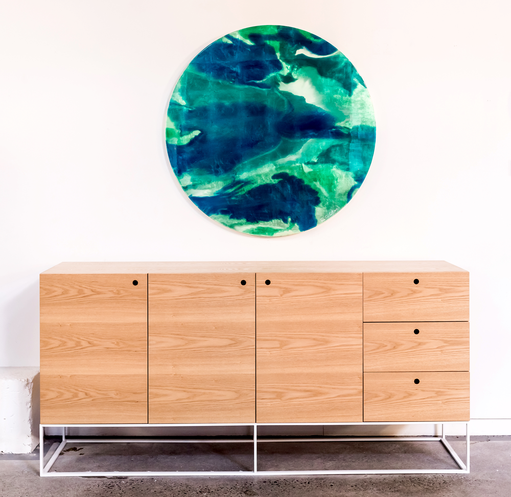
Step 1: We like to start with a large piece of art, or a mirror can look great too. Hang it just above your console - too high and it can look disconnected from what's going on below it.

Step 2: A lamp is a great starting point. It adds height as well as light for functionality. We've chosen a lamp with a fabric shade we had custom made. The shade will soften the light rather than having directional light like a desk lamp.

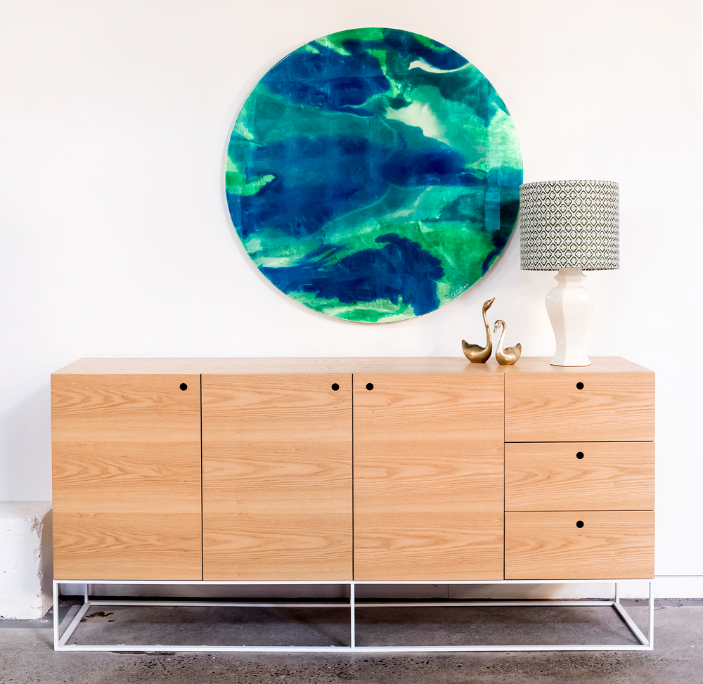
Step 3: Add something sculptural or quirky, purely for fun. We liked the curves of the swans next to the round artwork and the curve of the lamp. The brass links to the subtle gold found in Rae's artwork (although it's hard to capture this on camera).

Step 4: Books are a great tool for grounding objects, they act like a little platform for smaller pieces like bowls or vases. They also add a bit of weight and squareness to balance the curves. If you're anything like me (book crazy!) you'll love the chance to have some of your favourite coffee table books on display.

Step 5: To balance the right side we added a large floral arrangement. It's always great to add fresh flowers or greenery. They bring life and add another sculptural and textural element. We were lucky enough to have this stunning arrangement by Laura Jeffares, but if you don't have access to Laura, a pot plant in a beautiful planter will do the job, or grab your secateurs and snip some greenery from your garden.

Step 6: We could've left it at that last step, but that little space to the right of the vase felt like it needed something. A little dish, bowl or tray is handy for throwing your keys, sunglasses etc in as you walk in the door. It's a functional piece and also another low, horizontal element to balance the height of the vertical pieces - it's all about the balance.

So there you go, six simple steps to create a pretty good looking console. We've kept our colour palette consistent with greens and blues to compliment the artwork, and pinks, gold, and the light wood of the console to balance those cool tones.

This beautiful artwork is for sale, so if anyone is interested in purchasing a stand out piece for their home, please get in touch with us. You're welcome to come and see the art in our showroom so you can truly appreciate it's beauty. Make an appointment to make sure we're not in a meeting or out and about, as we'd love to give you our full attention.

Dream Home

I loved this first image (below) the moment I spied it on Pinterest. The blue walls and door are gorgeous, and I love how it frames the view through to the rooms beyond. So you can imagine my excitement when I found the entire home on Elle Decoration and every room was equally as gorgeous!

It belongs to Swedish blogger and photographer, Kristin Lagerqvist. Like me, Kristin has always loved blue, finding it a soothing, comforting colour. Blue is the common thread throughout the home where it features on walls, in wallpaper, furniture and accessories. It's balanced by fresh white, warm, rich wood tones and mossy greens.

Kristin used North Sea Paints, and they helped her develop the special shade of sky blue naming it after her - Krickelin Haze Blue ("Krickelin" is the name of her blog).

I love the wallpaper in the office (FYI... we can get this wallpaper for you, in case you love it as much as I do - email me for the details). The vintage desk and dresser, along with the chandelier Kristin inherited from her grandmother, add warmth and give the room a sense of depth and history.

The large kitchen is spacious and functional with beautiful brass handles and a marble bench top. I was happy to see the gorgeous blue and white bowl on the bench, as I have exactly the same one in my kitchen - great minds!

Also sharing my love of pattern, Kristin has used all sorts of amazing wallpaper throughout her home. The Designers Guild paper in the entranceway is another wallpaper you can source through us here at Bibby + Brady.

Stepping away from the blue tones momentarily, the bedroom is wallpapered in a restful tone of soft sage green. It echoes the greenery found both outside and inside the window.

I'm finishing this post with another room that makes me really happy. It features a stunning William Morris wallpaper in a metallic bronze. Originally produced in the 1880's it looks incredible in this 21st century home.

Photos: Andrea Papini  | Retouching: Jenny Soderstrom

There isn't one thing that I don't love in Kristin's home. The combination of colours, patterns, furniture and art choices are all amazing. This might just be my dream home!

Industry Ink | Giveaway

Industry Ink is the creative design brand of Dunedin based artist and designer, Rachel Sutton, and we're very excited to introduce you all to her work and offer you the chance to WIN A BEAUTIFUL A3 PRINT.

With a background in graphic design, fine art and product development, Rachel founded Industry Ink in 2014 with the belief that everyone should have the opportunity to fill their spaces with art. Industry Ink offers something for those art lovers who enjoy quality artwork at a more affordable price. She began by selling her prints to design stores throughout New Zealand, and in July this year, she launched her new website and online shop.

Rachel specialises in portrait art and currently has a love of dark inky monochromes. Her current ranges comprise of graphic fine art prints and photographic art prints. Her graphic fine art prints are all created freehand on her computer, and she uses her own photography for her photographic prints. All prints are limited editions, signed and numbered, and are printed on 100% cotton rag fine art paper using archival inks. Rachel believes in quality over quantity. "Keeping the collections small and signing each one adds to the quality of each piece," she says.

Rachel has a love of black and white photography, particularly portraits. "I'm inspired by textures and shadows, and am drawn to eyes and how they capture and evoke emotion", Rachel says. Her love of Scandinavian interiors and minimal colour palettes is evident in her work. Old dark room techniques, like playing with different exposures and solarisation, has also influenced her creations, hence the use of monochrome and inky imperfections in tone. "With a background in graphic design and fine art I try to merge the two disciplines by replicating fine art techniques, like textures and markings, with computer graphic brushes", Rachel explains.

Rachel plans on introducing a range of hand drawn fine art prints to her website in the near future, and expanding her photographic range. She would also love to collaborate with like-minded artists and stock other products to compliment her art prints.

The latest Industry Ink collection is Queens - beautiful portraits featuring native New Zealand birds. We have an A3 print of my favourite, "Tui" to giveaway this week.

CONGRATULATIONS TO OUR WINNER - Kathryn Downey. Enjoy your beautiful print, Kathryn.