Napier Hill Home Renovation

We’ve recently finished working with a fabulous client, helping her renovate her home on Napier Hill. Rachael had moved to Hawke’s Bay from Wellington with her two young children and bought a beautiful old character home. It had great bones and stunning views over the hill and out to sea, but the layout wasn’t quite right and the interiors were a bit tired. After working with Citrus Studio Architecture on the plan, Rachael hired local firm Davcon Construction to complete the renovation. It was Davcon director, Julian Davis, who recommended Rachael talk to us about her kitchen design. Jules knew we’d be able to guide her through all the tricky decisions regarding colours, bench tops, cabinet style, handles etc.

The old kitchen was completely removed and this space (above) has now been turned into a media room for games and movie watching. Walls came down and moved to create a much better flow and layout throughout the house, and the kitchen moved over into the old dining room.

After putting the design concept together for Rachael’s kitchen, we worked closely with our joiners, Sydaz, to bring the design to a reality. We’ve developed a great working relationship with the Sydaz team, so it was a really fun project to work on. Both Davcon and Sydaz have exceptional workmanship, it was amazing to watch both teams help bring our design to life.

Our initial idea was to have a beautiful soft sage green on the bottom cabinets, but to achieve this look with the cabinets painted in a two pot polyurethane was a slightly more expensive option. In the end we opted for a more cost-effective thermoform finish in textured limestone, which is essentially a soft white. We then put a beautiful light grey with a hint of green on the walls to bring in some tone while still keeping the space calm, light and airy.

We’re all in love with the bench top we chose. It’s an engineered stone with a textured matt finish. It features a white background with velvety grey swirls and smaller specks of dark grey. Dael took Rachael out to the Archant warehouse in Hastings where they could view the actual slab of stone. This enables our clients a much better idea of how their bench will look, although we always start by showing them a small sample square. Carrying the stone up the wall as an up-stand was the finishing touch - we love it.

You can see from the progress shot (below) that we put a pull-out pantry and integrated fridge along the wall to the right of the main kitchen. There was nothing we can do with that wall in-between, as behind that is the powder room. Positioning the kitchen island long ways helped to connect everything…

But what really succeeded to connect and ‘zone’ the kitchen area was the wall panelling we asked Davcon to create. It absolutely worked with the style of the home, and wrapping it along the wall between the two pantries, and over on the opposite wall, clearly marked the kitchen area from the adjoining dining area.

The media room, where the old kitchen used to be, is off the kitchen, and we love the sneaky peek of the deep blue walls against the soft grey/green walls in front.

media room re-gibbed and ready for it’s transformation.

loving it’s smart new colour scheme.

The entrance, kitchen and dining room have had new flooring put down. Rachael came home from Hutchinsons with a selection she had chosen and we helped her narrow it down to these boards, which look fantastic. These were the sorts of questions we helped Rachael tackle throughout the reno, another was which way to lay the boards. We would usually recommend running the wood from the front door straight to the back of the house, but the front door sits at the side of the house (to the left of the dining room entrance above). So, although the boards run across the entrance, they then lead your eye down to the beautiful big doors and view at the back of the house.

Rachael already had her dining table, chairs and rug. We sourced the pendant lighting for the kitchen and dining room, helped with art placement, and the colour to paint the fireplace. We sourced the kitchen handles from Archant and the chopping board, bowls and jugs are all ours.

The narrow double doors in the living room (above) were removed and an opening was made on the other side of the fireplace for easier access from the front door and kitchen through to the rest of the house. Large sliding doors were put in (below) to take advantage of the view and the light.

With new carpet and freshly painted walls, Rachael just asked us to help her choose a new sofa, coffee table, side table, and pendant light. We had this sofa custom made for her by one of our NZ furniture manufacturers. They’re made in New Zealand, and the quality and workmanship is superb, so it will last her a long, long time. To keep the cost down slightly, we chose a hardwearing but more cost-effective fabric in a gorgeous deep teal. The large coffee table is the perfect scale for the sofa, and the double layer is handy - you can pop baskets for storage on the bottom layer, or spare cushions. We also had new curtains made in a beautiful soft grey linen blend.

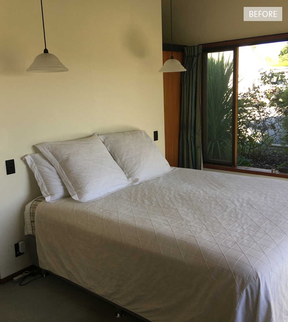
Rachael’s bedroom has these lovely character features, but we helped give it a mini makeover with a new wall colour, new curtains, and a new window seat squab.

The wall colour almost glows it’s so warm and gorgeous. It’s a dusty umber and ashen red toned neutral. OK, it’s pink, but it’s such a sophisticated colour that feels serene and restful in the master bedroom. The linen hydrangea cushions (below) we had custom made - all available to purchase from us.

Directly opposite the master bedroom is the tiny powder room. With no natural light this space would’ve looked flat if we painted it white, so we chose another soft, pretty colour.

The family bathroom was created from scratch in the old entrance area. A large space, we created wall-to-wall storage down one end to house the laundry as well as an extra cupboard for the mop, broom etc. I say “we created it”, but clearly Davcon did all the hard work…

And then Sydaz did a fantastic job creating all of the cabinetry. We chose the tiles from Tile Space, and used HardieGroove™ on the walls to add subtle texture.

The children’s bedrooms also only required mini makeovers. In Rachael’s son’s room it was choosing a colour that he would love, and also one that would grow with him into his teens. Also a cool new window squab so he could enjoy his epic view - lucky kid - and new bedding!

In Rachael’s daughter’s room we opted for a warm, happy colour scheme to add a bit of fun and interest. We kept the colour to the bottom half of the walls, and mixed it up with some different coloured bedding.

And here she is… Rachael was one of our most favourite clients and a joy to work with. We were so impressed with the way she managed a massive renovation with two young children, whilst holding down a very important, full-time job. No matter how smoothly everything goes, renovations are often still stressful, just because of the disruption they cause to your life. But this one was well worth it! The other reason we love Rachael is that she listened to us, trusted us, and followed through with everything we suggested. This is always the best outcome, so thanks Rach, and thank you for allowing us to share your beautiful home. x

Te Awanga Home Design

October was an exciting month for us with the home of one of our long-time clients being photographed for the latest NZ House & Garden magazine. We worked with these clients over a three year period. The first year was dedicated to Chambourcin Cottage, and the next two we slowly moved through their main home, room by room creating a cohesive look. The cottage and the main house are only metres apart.

Both houses were architecturally designed by Steve McGavock, who was the protégé of renowned architect, John Scott. It’s a really special property with a lot of the trademark features found in a John Scott home - high vaulted ceilings, large pivot doors with rimu knob handles, rimu architraves and trims. Set on its own vineyard, the main house is designed so that all of the bedrooms, the living and dining rooms overlook it. There are two wings with the master bedroom, ensuite and ‘snug’ at one end; the office, guest bedroom and bathroom at the other; and the kitchen, laundry, living and dining in the middle.

We used Resene Merino on the exterior of the home to tie in with the cottage opposite. Merino is a light and versatile off-white, and we wanted a freshness without it being too glary. We looked at several different colours for the front door. It was initially painted hot pink, but after much deliberation it was re-painted a golden mustard. We had the outdoor rug custom made to fit the front porch.

Before1.jpg

All of the windows had the original rimu curtain tracks and we wanted to keep these beautiful details. But we did replace the curtains throughout with beautiful soft linen from James Dunlop. The inside entrance rug was also custom made to fit the space. Every room has it’s own rug, all Armadillo&Co from our friends at The Ivy House.

Before2.jpg

It really was a blank canvas for us when we first began this project. We had already explored a lot of the design choices for the base of the house when we designed the cottage. The main living area walls were painted Resene Half Merino, and the dark brown beams painted a sharp black. All the carpet was ripped up and the concrete floors beneath polished.

We commissioned local artist, Billie Culy, to create the stunning artwork in the living room. Billie worked closely with us and our client, Kim, using a colour palette we supplied her with to fit perfectly into the space. We had chosen a Billie Culy piece for the cottage, so it was nice to have that connection between the two houses. The large orange and white rug was also custom made by The Ivy House, and its job was to zone the living area and anchor the furniture.

Before3.jpg

We custom made the window seat squabs and all of the cushions. Every furniture piece was carefully chosen to suit the style of the home, including the vintage Ole Wanscher rocking chair from Mr Bigglesworthy, which we recovered in a mustard wool.

A ladder against the back living room wall leads you up to a cute little loft area which looks down over the living and dining rooms and out to the vineyard. We chose a smart navy blue for the cupboard door and Bruce, our client, painted this along with all of the walls and beams.

Before5.jpg
Before4.jpg

We had a sofa custom made in soft grey linen to fit the space, and added some simple furniture pieces to turn the loft into a place to escape with a good book or a glass of wine (although not too many, as you have to navigate the ladder on the way down).

The loft overlooks the dining room. The linen curtains we had made are so gorgeous. We kept them really simple to work with the clean lines of the architecture, and so as not to distract from the views. The vaulted ceilings meant they had to be a super long drop and they hang off the original rimu tracks.

The dining room also has spectacular views over the vineyards and out to the hills beyond.

Before6.jpg

Because the living and dining rooms are open plan we helped to zone the dining area with a stunning big David Trubridge light above, and a luxurious hand woven midnight blue rug anchors the table. When using a rug under a dining table you need to make sure it’s large enough to pull the chairs out whilst still remaining on the rug.

Before7.jpg

After much deliberation our clients opted to keep the kitchen as it is - the rimu cabinetry is synonymous with the John Scott style. We added some lighter chairs around the breakfast bar. The artwork (below) opposite the dining table is part of a triptych that we had commissioned by textile artist, Jane Denton. We chose a Jane Denton piece for the clients’ cottage, and Kim loved it so much we knew we wanted to incorporate her work into the main house too.

The fireplace in the living room was removed quite early on and made the flow through to the end of the house so much better.

Before8.jpg
Before12.jpg

A beautiful large pivot door separates the living room from the ‘snug’ and master bedroom. The deep teal we chose for the walls of the snug allows the door to stand out, and looks amazing behind the painting we bought from Amber Armitage.

Before9.jpg

With a lot of different textures combined in the fireplace, we decided to simplify it by plastering over the red bricks at the base and painting them black so the fire disappeared into it. We then added a feature tile on the hearth and framed it with rimu.

Before10.jpg

The ‘snug’ is the room that gets the least amount of natural light, and our clients use it to read or watch TV in the evenings. Rather than trying to lighten the room, which can often look a bit flat, we opted to paint the walls a rich, dark teal. A large, plush mustard rug compliments the blue walls and adds cosiness.

We added new linen curtains, a pair of super comfy and stylish armchairs from Hutchinsons, and an antique brass coffee table from Soren Liv. The side table was custom made by WRW & Co. along with a small TV unit (not pictured).

On the adjacent wall we placed a beautiful brass bar cart under our clients print to help ground it.

Before11.jpg

Tucked behind the ‘snug’ and to the side of the living room is the master bedroom, which has ‘his and her’ wardrobes behind the bed. We put a green and white wallpaper on the back wall to reflect the views outside the windows, and brought some warmth in with amber bedside pendants and cinnamon coloured linen from Thread Design. The bedspread is from Seneca, and the custom made cushion pulls all the colours together.

The other wing of the house consists of this small bedroom (below) which we turned into an office, as well as a guest room and guest bathroom. We re-carpeted both of the bedrooms and the office, but still added rugs to each for extra luxury.

Before13.jpg

We painted the walls in the office and guest bedroom a soft and peaceful duck egg blue. We love it here teamed with one of our favourite pink sofas, custom made cushions, and a map of Maine (where Kim is originally from). The touch of black in the lamp and side tables adds a bit of weight and links to the black beams.

photo: Florence Charvin

Before14.jpg

The guest bedroom has new linen curtains like the rest of the house, new bedside tables, a rug, and beautiful new bedding. Other touches are the pottery wall light and pendant we designed, and bench seat (not pictured).

It’s been quite the adventure, and a real pleasure working with Kim and Bruce on their amazing home and their cottage. She really is a very special property and we will miss her! Make sure you check out our blog post about the journey we took with Chambourcin Cottage.

All photos (other than ‘before’ photos) taken by Florence Charvin for the November 2018 issue of NZ House & Garden. With thanks x

Jen Sievers | Greenhouse Interiors

Before interior design became my life, what seems like a lifetime ago, I was a graphic designer. I was lucky enough to work with a variety of clever and talented people, and one of those people was the beautiful Jen Sievers. We were both working as graphic designers in a small marketing firm, but, as often happens, after the birth of our children we both changed direction slightly - me to interiors and she to fine art.

photo: Sarah Starkey

Jen has been going from strength to strength since she started painting again three years ago, and I have really enjoyed seeing her become so successful doing something she loves. Her latest achievement is so exciting, as she and I have both been huge fans of the two women Jen has recently collaborated with - Julia Green and Armelle Habib.

Julia Green is an incredibly talented stylist and writer and the founder of Greenhouse Interiors, an online destination for boutiques textiles, homewares, and fine art. Julia contacted Jen earlier this year interested in selling her work. Of course this was a no-brainer for Jen, who, like me, was a big fan of Julia's work. "So I painted a collection for her. It's been a whirlwind of work and excitement", Jen explains. "Being a part of her (Julia's) gang has been an impossible dream since the start. Life is full of incredible surprises!"

Julia worked her magic with Jen's new collection, styling each piece in a room setting which compliments and highlights the artwork. The settings were then photographed by another of our idols, Armelle Habib, who captures them so beautifully.

You can view all of Jen's latest collection here on the Greenhouse Interiors website. I'm sure you'll agree with me, the collaboration between Jen, Julia and Armelle is a winner!